Redesigning the campaign entry point in Spotify Ads Manager — exploring card selection patterns, crafting an expressive objective picker, and introducing motion into the ads product for the first time.
My role
Lead Designer
Platform
Spotify Ads Manager
Timeline
2024
Design artifact — Campaign page · Objective selected state
advertising.spotify.com · Ad Studio
Overview
Rethinking the first moment of campaign creation
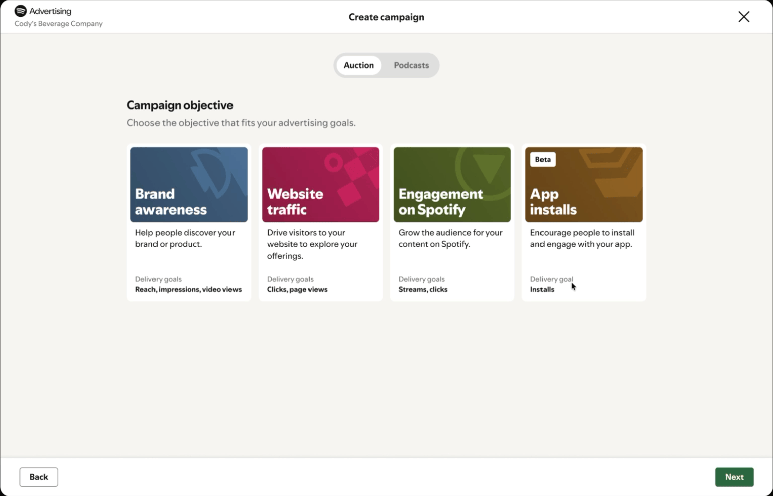
Campaign creation in Spotify Ads Manager started with a promotion-type selector — product, musician, concert, or podcast — a pattern inherited from the platform's early days. The entry point felt utilitarian and generic, with no visual hierarchy to help advertisers understand the differences between objectives or feel confident in their choice. It was a flat list that told you nothing at a glance.
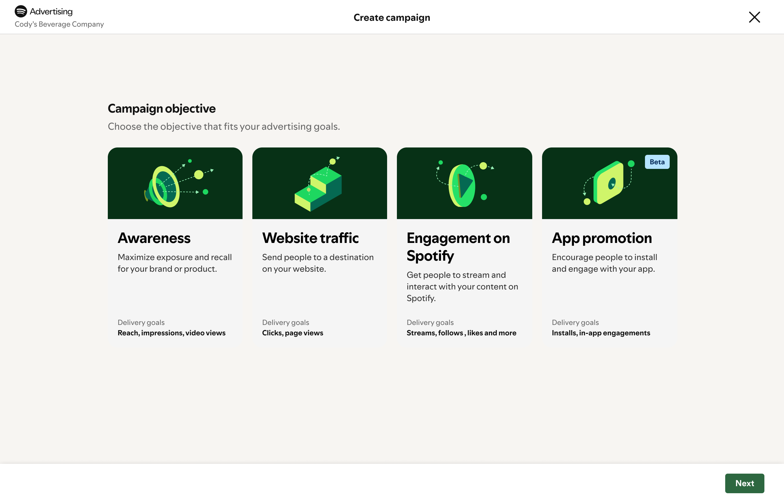
I redesigned this moment as an expressive card-based selection experience. Each objective — Brand Awareness, Website Traffic, Engagement on Spotify, App Installs — received its own visual identity with distinct color, illustration, and animation. This was the first time motion was introduced into the Spotify ads product, bringing hover states, selection transitions, and micro-interactions that made the experience feel alive. The goal was to make the most consequential decision in campaign setup feel intentional rather than arbitrary.
Design process
Designing through exploration
01
Card & selection explorations
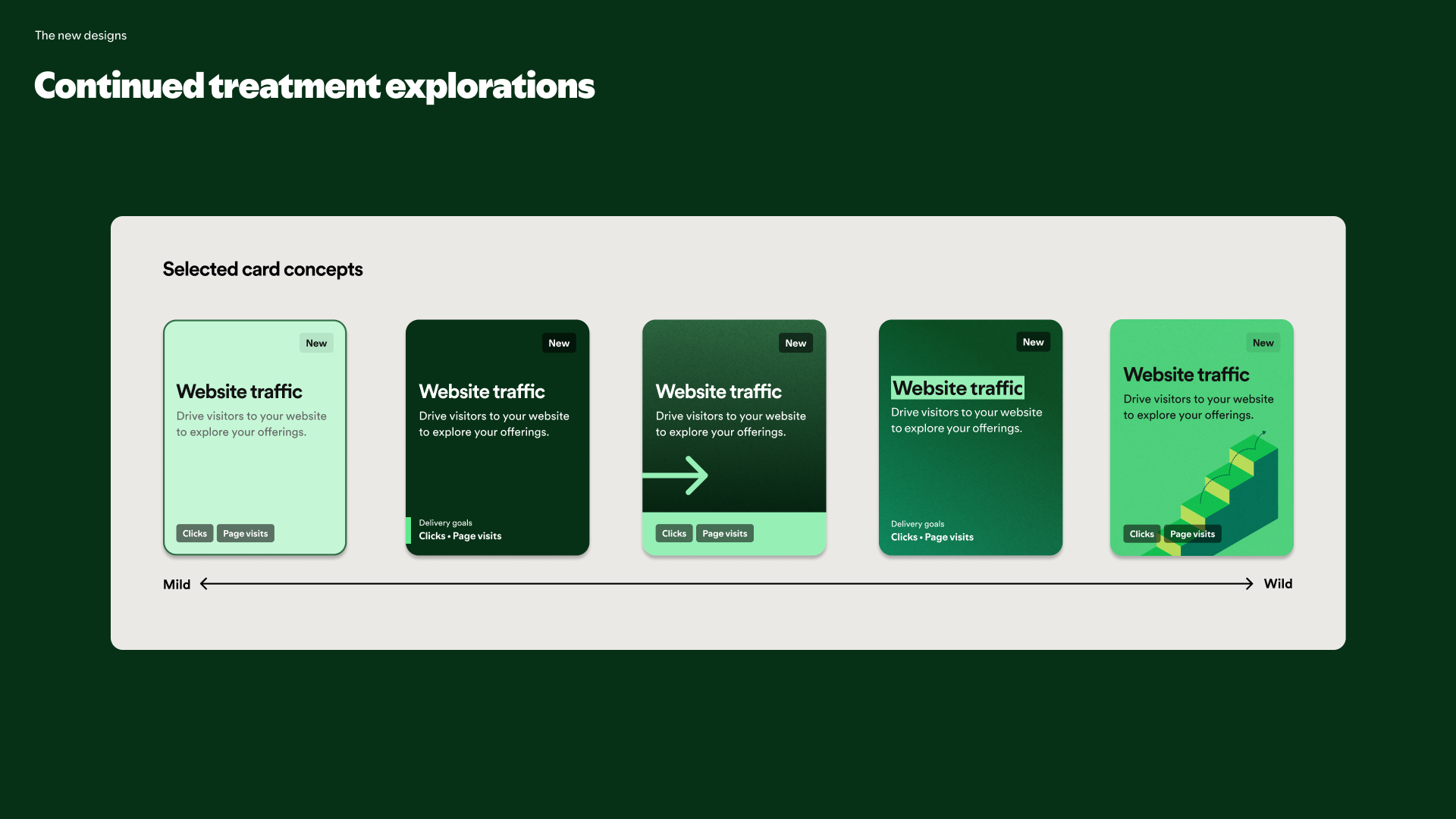
Explored dozens of card variants — from compact pill-style selectors to full-bleed illustrated cards. Iterated on visual weight, information density, and selection affordances to find the right balance between scannability and expressiveness. Tested how different layouts performed when objectives scaled from four to six or more.
02
Entry point redesign
Redesigned the campaign creation entry point from a flat promotion-type list to an expressive objective picker with distinct visual identities per goal. Each card carries its own color, illustration, and description — making the most important decision in campaign setup feel considered rather than buried in a form.
03
Introducing motion
This was the first time motion was introduced into the Spotify ads product. Designed hover states, selection transitions, and card micro-interactions that brought the objective picker to life — setting a new precedent for how interactive moments should feel across Ads Manager.
Early exploration
An earlier direction explored isometric illustrations and a lighter card treatment. This was one of many visual explorations before landing on the bolder, more expressive design.
advertising.spotify.com · Ad Studio — early concept
Card explorations
Exploring card design variants — iterating on visual weight, selection affordances, and how each objective communicates its identity at a glance.
advertising.spotify.com · Card design iterations
User testing
Validating the design with real advertisers
We partnered with UX Research to run an unmoderated A/B concept test with 24 participants from UserTesting.com — B2B and B2C advertisers across the US, UK, and Canada who actively manage campaign development and media buying. The study tested two design concepts: Concept A with minimal content focused on campaign outcomes, and Concept B with supporting content that also surfaced delivery optimizations.
The core question was whether advertisers could quickly assess objectives and confidently select the right one based on the content provided. Participants were given scenario-based tasks — like choosing an objective to drive sales for a new product launch — and we coded their selections against success criteria. The research directly shaped how much information each card surfaced and validated that the expressive visual treatment helped advertisers differentiate between objectives faster than the previous flat list.
Design highlights
Decisions that shaped the work
🎨
Expressive card system
Each objective received a unique visual identity — distinct color, custom illustration, and typographic treatment. The cards needed to communicate at a glance without relying on description text alone, making the selection feel more like a considered choice than a form field.
✨
Motion as a design language
Introduced hover animations, selection transitions, and micro-interactions to the ads product for the first time. These weren't decorative — they provided feedback during selection, reinforced hierarchy, and set a new bar for how interactive moments feel across Ads Manager.
🧩
Scalable selection pattern
Designed the card grid to accommodate growth — from the initial four objectives to future additions like Leads and Sales. Explored how the layout, card sizing, and visual rhythm would hold up as the system expanded without degrading the selection experience.
🔬
Iterative visual exploration
Moved through multiple visual directions — isometric icons, gradient treatments, minimal line art, bold illustration — pressure-testing each against the dark Ads Manager UI. The final direction balanced expressiveness with the product's existing design language.
Impact
Setting a new design standard
The objective picker shipped as the new entry point for campaign creation — and became the first surface in Spotify Ads Manager with motion design. The card system and interaction patterns established a design precedent that influenced how new features across the product are built.
4
Clear campaign objectives — from awareness to app installs — giving advertisers a common language for their goals
2+
Years of iterative design and research across the self-serve campaign booking experience
XFN
Cross-functional collaboration across design, content, product, engineering, and user research at Spotify